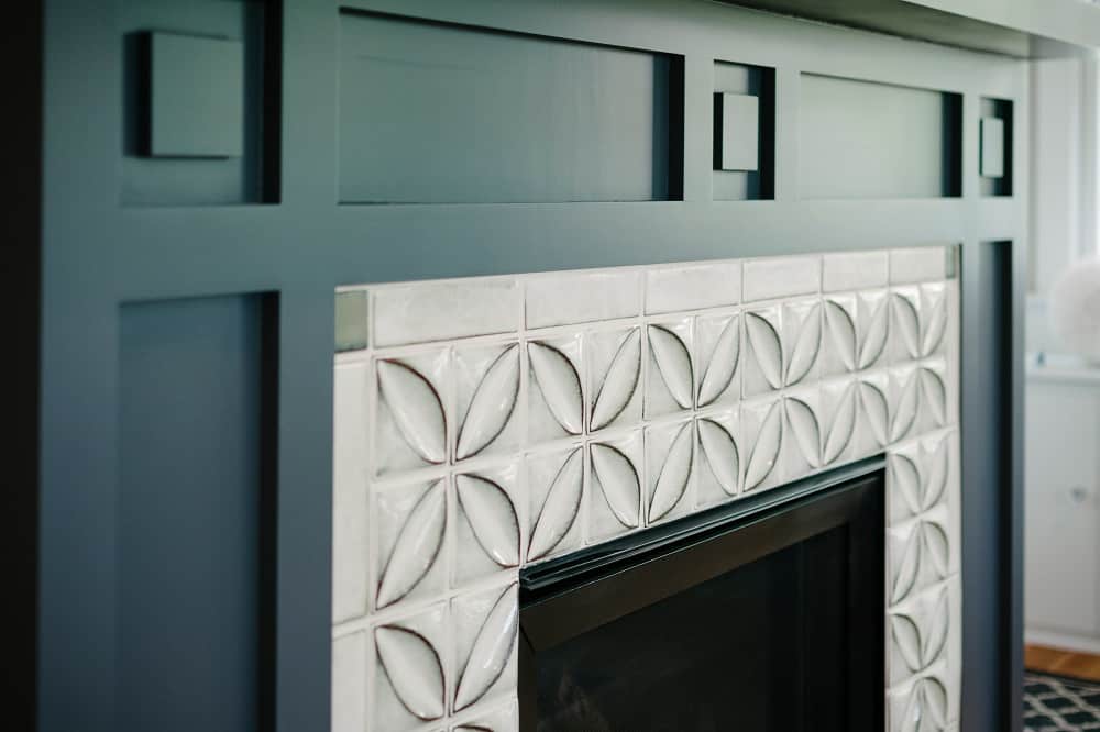
If you have a fireplace in your home, you are lucky enough to have a natural focal point. You can use the fireplace to set the tone for the rest of the room. Part of this is the design and style of the fireplace surround. Another part is the color you choose. The color you choose will influence your room’s entire design and feel. Choose the wrong color, and your fireplace design will fall flat. Choose the right color,, and it will become an eye-catching design. We will help you choose the right color for your fireplace surround.
[view_toc]
What Is the Fireplace Surround?
The fireplace surround is the decorative part of the fireplace that protrudes out from the wall that is above and on either side. Sometimes, it also includes a piece on the bottom, called the hearth.
Back in medieval times, the mantel served a functional purpose, to catch the rising smoke. However, over time, innovation and technology have made the mantle more of a decorative piece and less of a functional element of the fireplace. As a part of this development, people have added on to the mantlepiece to include the legs and hearth.
What Paint Do You Use on a Fireplace Surround?
The paint that you use on your fireplace surround needs to be able to withstand high heat. Look for a paint that is safe for use in areas that experience around 500 degrees Fahrenheit. Wood combusts at 300 degrees, which means your wood-burning fireplace can get much hotter than this. The paint you use needs to be safe for high heat because you are using it on an area that is right next to the flames in the firebox.
The type of paint that you use to paint your fireplace surround will depend on the material it is made out of. If your surround is made out of wood, then use an oil-based paint instead of latex. The oil-based paint won’t soak into the wood like water-based paint. This helps it to stick better and dry faster. It is also more durable, making it easier to maintain. If your fireplace surround is made out of stone or concrete, this is not an issue,, and you can safely use water-based paint. Vintage cast iron fireplace surrounds will get very hot, requiring them to be painted with a paint that has an even higher temperature tolerance.
If you use paint that is not specifically designed for use on fireplaces, you risk bubbling, cracking, melting, peeling, or even lighting on fire. The wrong paint can also emit harmful fumes when it gets too hot, which can endanger you and your family.
Color Ideas For Your Fireplace Surround
The color you choose for your fireplace surround will depend on its size, style, room color scheme, and room design style. You should choose a color that makes sense for all of these elements and the rest of the room. There is no one correct answer because everyone’s personal taste and home are different.
Neutrals
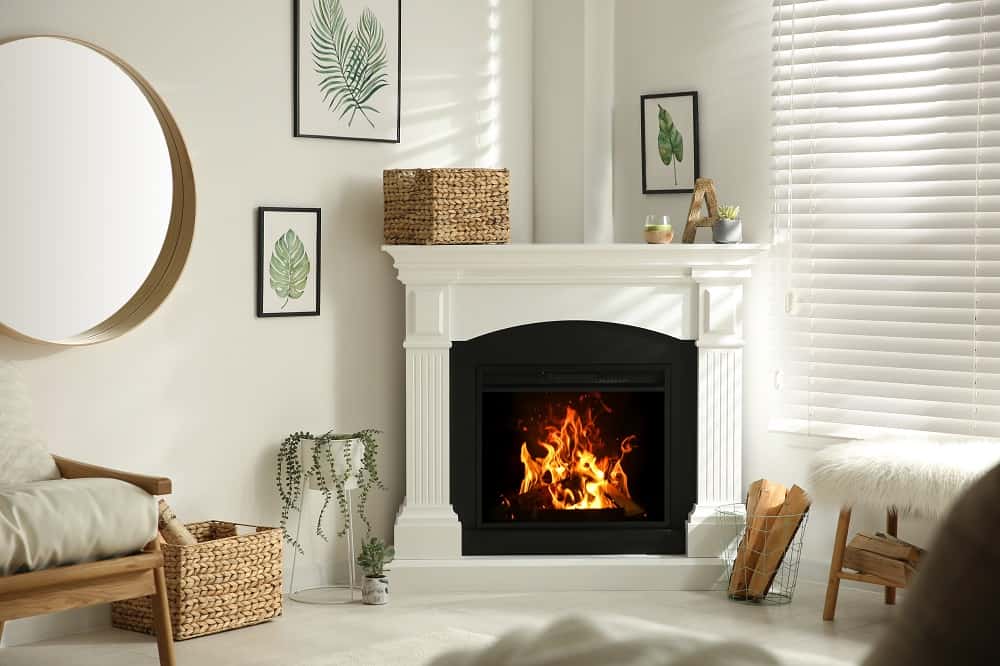
When talking about neutrals, we are referring to white, black, gray, and shades of tan or beige. These colors pair well with a wide range of colors, making them versatile. Choosing white is smart because you are probably already using white for the baseboards, crown molding, window trim, and door frames. Painting the surround with white creates a uniform look in the room by matching it to the rest of the accent trim pieces.
The opposite of this is using black, which, just like white, you can pair with any color. Black makes a stronger statement, and for many people, it makes a contemporary statement. For others, black is too harsh. The perfect alternative is to choose a shade of gray. Dark charcoal softens the look of black while still having a sophisticated feel.
Beige and tan are not colors that you will typically paint the fireplace surround. If these are a color that you’d like to use, consider creating the look with wood or stone instead. Then you get the color shade plus the added benefit of texture, color variation, and nature.
Contrasting
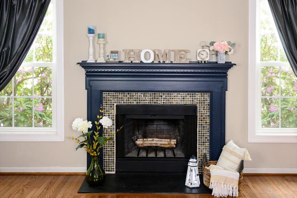
If you want your fireplace to take center stage in the room, choose a contrasting color. A common approach is to choose a contrast of light and dark colors. This creates a striking contrast while drawing the eye. If your walls are light or bright, choose a darker color for the fireplace surround. If your walls are darker, choose a lighter shade for your fireplace surround.
Contrasting can also be a difference in saturation. This is the amount of pigment the color has. For example, you could paint your walls a muted sage color that does not have a lot of color saturation. Then paint the fireplace surround a highly saturated plum purple, navy blue, or maroon. Not only are the two colors different, but the contrast in saturation makes a stronger contrast.
Monochrome
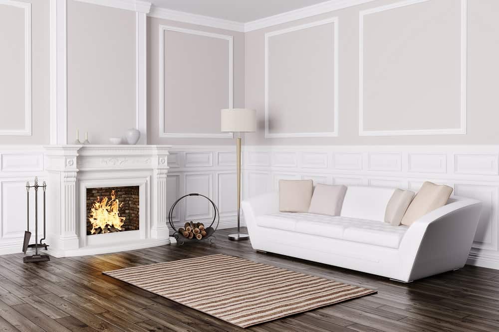
Taking a monochrome approach means that you will use the same color on the fireplace surround that is on the walls. Everything blends together because it is all a similar color. You can fully commit to this idea and literally paint everything the same exact color. However, this can make your wall fall flat as you lose the depth and dimension of the fireplace surround. To fix this, try using the same color but in varying shades of tint, shade, or tone. The fireplace surround can be the same color but slightly lighter or darker than the wall. This creates depth and subtly highlights the fireplace surround. It is a way of simplifying a busy design without completely losing it.
A monochrome design choice makes sense in a modern, minimalist, or even a Scandinavian-styled room. These design styles embrace simplicity and streamlined design. A monochromatic color choice highlights this by reducing the visual clutter and artfully blending the fireplace’s architectural feature into the rest of the room.
Complementary
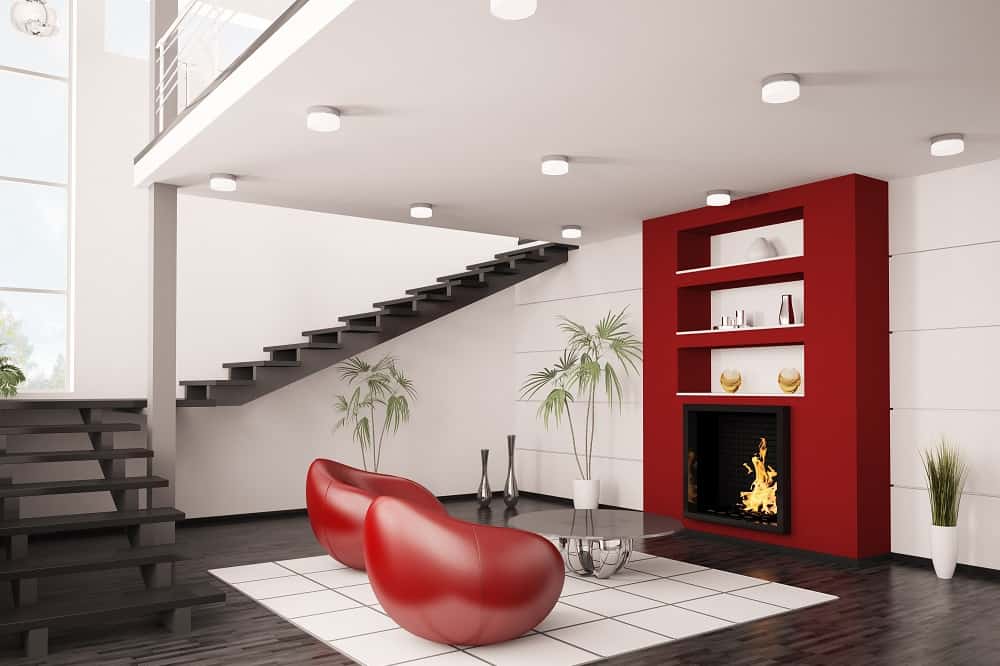
Choosing complementary colors means you choose two colors that are on opposite sides of the color wheel, such as red and green. The strategy works well for your fireplace surround because you do not want to use complementary colors equally in your interior design. Use one colors for the walls as the primary color in the room. Then use the complementary color on the fireplace surround as the accent color. Here are some complementary color combinations.
- Yellow and Purple
- Blue and orange
- Red and Green
- Red-orange and blue-green
- Yellow-green and red-purple
Consider the hue, vibrancy, tone, and saturation of each color. They need to balance each other, so try to use colors where these qualities are the same. That way, one color doesn’t overpower the other because one is more saturated or vibrant than the other.
Using a complementary color scheme is so popular because it can work in almost any interior design style. The key is choosing the right color scheme for the interior design style that you want to create. From farmhouse, rustic, and industrial to contemporary, bohemian, and maximalism, you can find the two complementary colors that will work in your room.
